2021・PRODUCT DESIGNER・EATS
Delightful Discoveries in Online Food Delivery
How might we improve user experience in finding the food that’s suitable for them?
CHALLENGES
In Post Launched Delivery, we see that our user are having difficulties in finding the meal they want to purchase, through the number of visit on our product pages. When we take a look at our search query, 90% of the time user are keying the name of food e.g ‘Chicken’, ‘Soto’, ‘Bakmie’. The designer are tasked to improve user experience in discovering and finding the food in our inventory. The design will be use in improving our search capability and inventory database.
IMPACT
The assessment after the first release are able to successfully increase the conversions rate* up to 14%
The team are also able to gathered better data in informing types of meal that’s popular to improve our categorisations. Moving forward, the findings of research on the importance on having quality pictures are also taken as separate project as part of inventory completions in supply team.
*Conversion of Search to Menu/Product page
PROCESS
I investigated our current capabilities and finds 2 main problem
Our existing database hierarchy wasn’t design intuitively for users nor it was having a clear structure.
Our search capabilities builds from previous data infrastructure where the inputs (tagging) are still done manually and no clear categorisations placed.
And so, what the design proposing is to
Enhance overall search experience within demand app
Improve the database structure to support delivery service & improve the process of storing data in from our supply team.
ENHANCE OVERALL SEARCH EXPERIENCE
To answer the first objective, I decide to conduct an evaluative research of our existing flow.
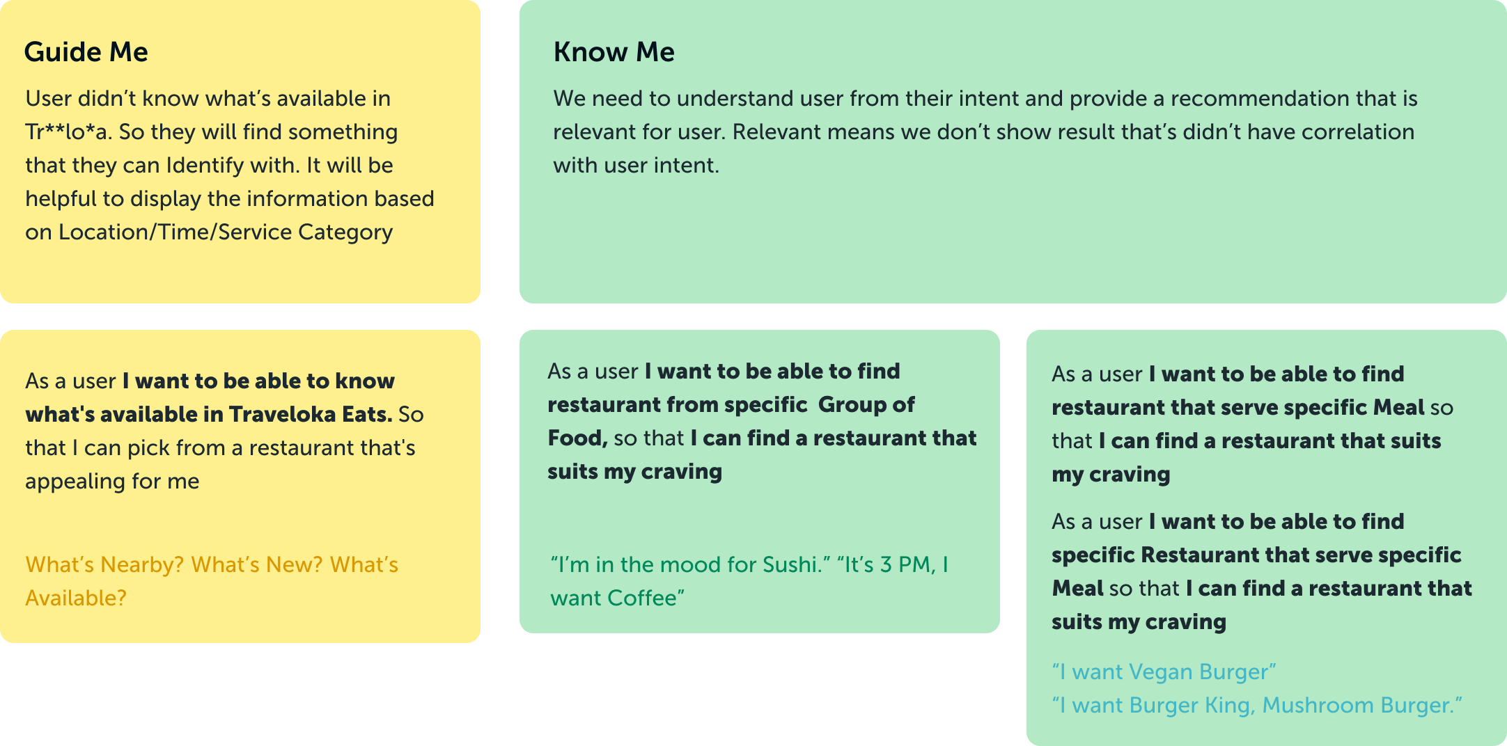
I found that when searching for a meal/beverages, user intent are affecting their way of inputting keywords in our search. Therefore facilitating different intent within our flow would increase & drive the discoverability of our product’s inventory.
Further research findings can be read here
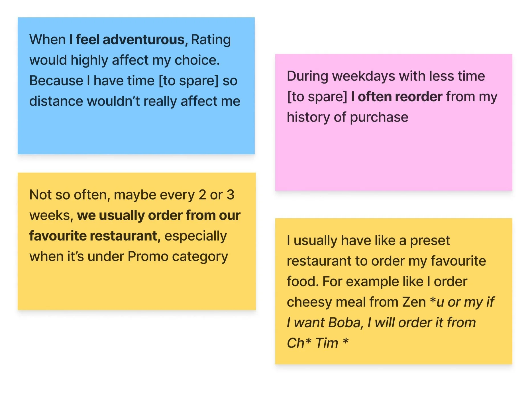
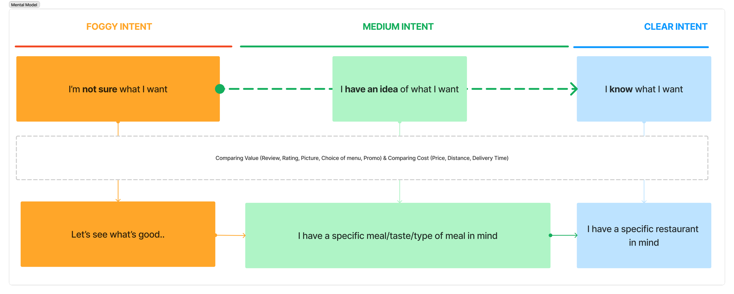
Foggy Intent — I don’t know what I want to eat - I’m open for recommendations
Medium Intent — ‘I know what I’m in the mood of’ e.g “I want to eat Chicken today”
Clear Intent — ‘I know what I want, specifically’ e.g I want to eat at Kenny Rogers
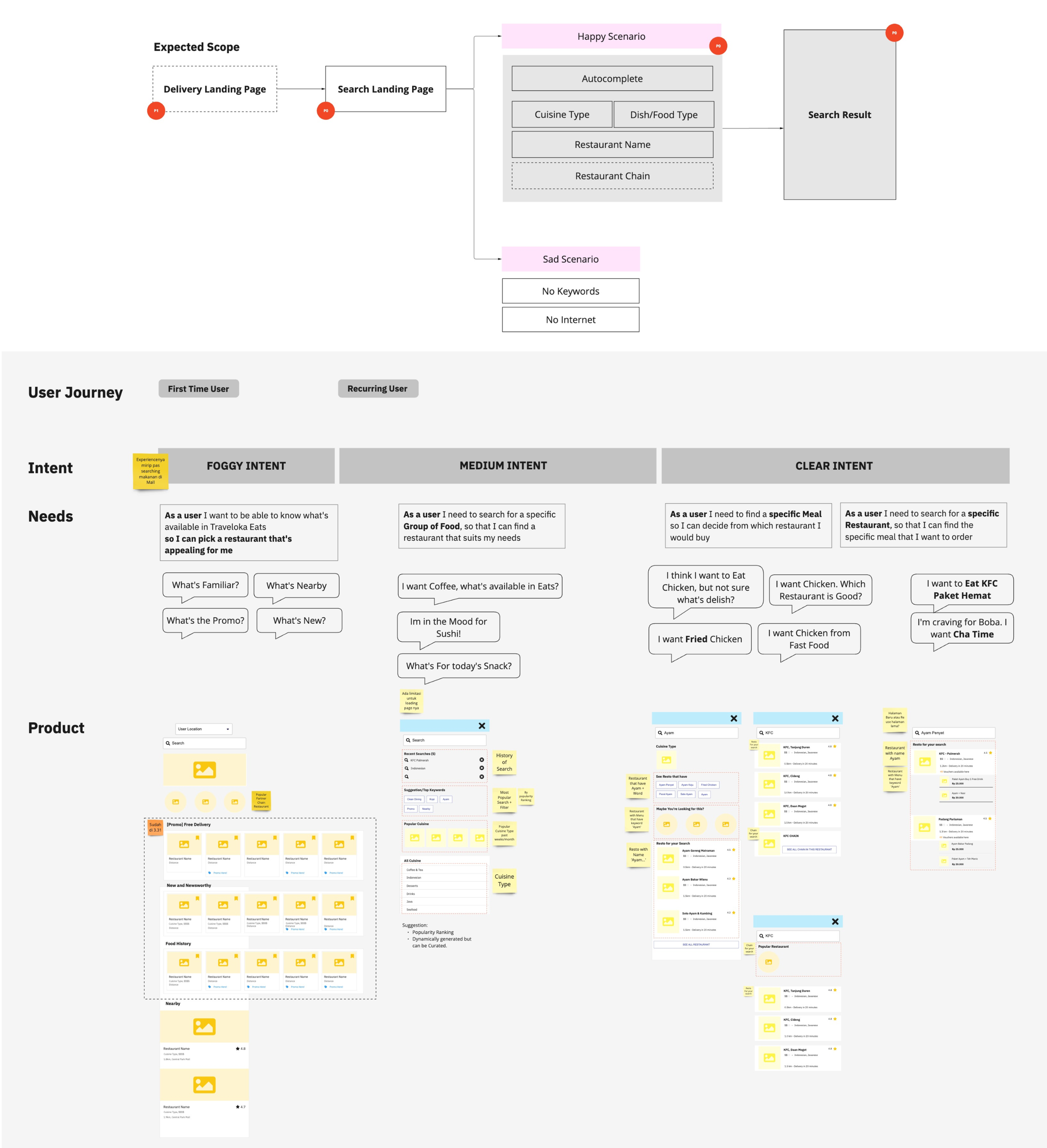
I mapped user’s intent within user discovery journey and create a design for the information architecture across that page. These information architecture would become the blueprint for improving the database structure.
IMPROVE THE DATABASE HIERARCHICAL STRUCTURE
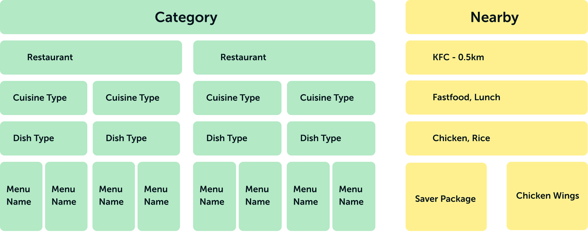
Previously, the smallest element in our data is dish type. This cause user unable to search based on menu available and instead only able to find based on restaurant name.
In this data structure we add category and menu name. Each Category consist of Restaurants and within restaurant there will be cuisine type e.g Fast food, Lunch and Dish Type i.e Chicken, Rice. and the smallest element would be the Menu Name which can all be tied back to the restaurant/product name.
We’re also talk to our supply team to ensure that the fields are added within their tools and request our backend in enabling automation in the process of uploading content.
I created this design principle as a guideline for creating user experience in the app. The principle helps the team in adhering to common principle which improve the way we communicate during the project.
DESIGN OUTPUT
PREVIOUS DESIGN
This is the example on principle implementations in improving previous UI of the product.
Search Landing Page
👎🏼 Prompt user to search restaurant nearby after user click search wasn’t very intuitive. It doesn’t represent ‘guide me’ nor ‘know me’ based on user intent
Search Recommendation I
👎🏼 The recommendation didn’t offer guidance in narrowing user options
👎🏼 The list display not necessarily anchored to user location (e.g closest to furthest by distance)
👎🏼 Picture aren’t appealing to help guide users
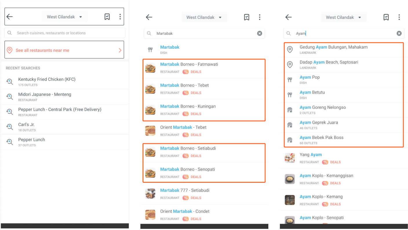
Search Recommendation II
👎🏼 Ranking isn’t helpful to predict user intention when searching for ‘Restaurant that sells ‘Ayam’ and not necessarily restaurant that have ‘Ayam in the name’
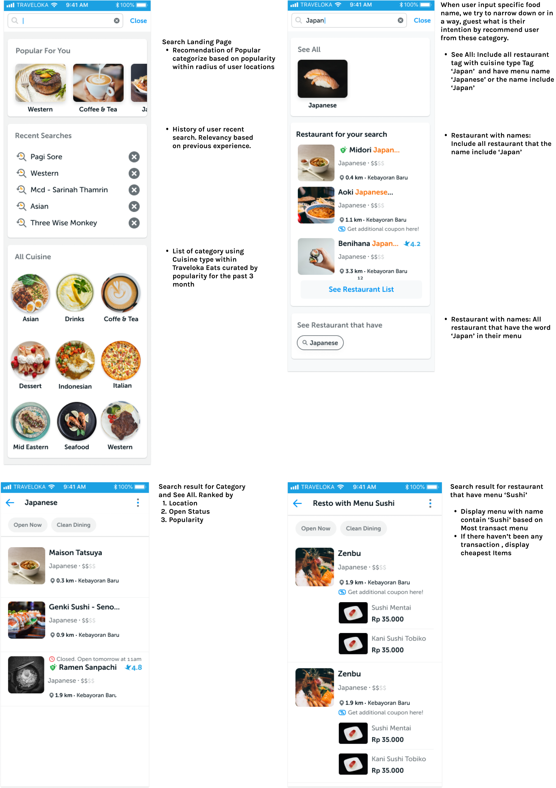
On this design the aim of search landing page is providing range of categories when users are still unsure or have a vague idea on what to choose and might not sure what’s available on our inventory.
On Search Landing page, the categories are group into 3 based on proximity, history and familiarity - all three aspects that user consider as valuable.
I also apply some of gestalt principle such as Proximity, Continuity and Pragnanz to support the overall experience in processing informations.
Disclaimer: Although within our finding we acknowledge the importance of rating, the team consider it not feasible for this release thus affecting our search ranking for this release.
FINAL DESIGN
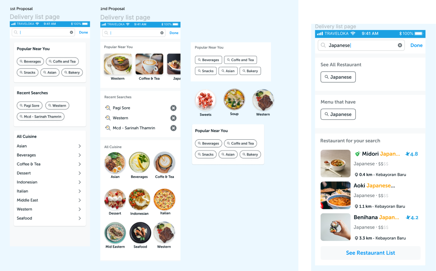
BONUS: DESIGN EXPLORATIONS ON SEARCH PAGES AND SEARCH QUERY RESULTS PAGE
ROLE & PROCESS SUMMARY
As a Product Designer and PIC of the project, my role is to
Plan project timeline and the resource required.
Plan and execute a Evaluative Research to understand user mental model when searching for food
Ensure that the product requirement match with the stakeholder’s need
Produce designs of wireframe to hi fidelity for implementations
Helping in ensuring the quality of feature release with minimal to zero bug